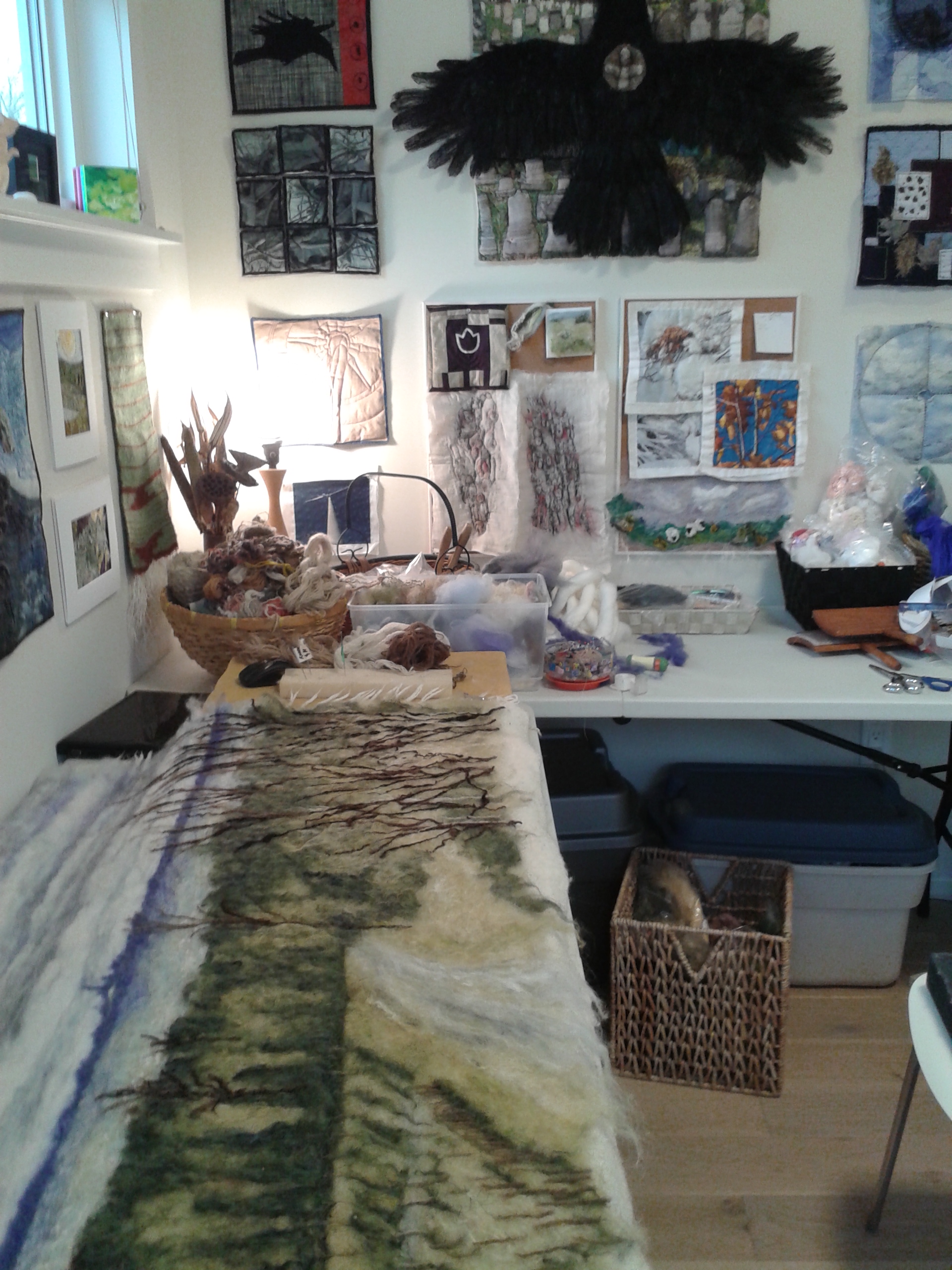
Snow-laden branches have been a fascination and source of inspiration for some years. Standing under a bower or cathedral formation, has been a compelling inspiration in many recent works. I started work on this needle felted work after gaining permission to use Anita Payne’s photograph from early December, 2023, based on a walk that she and her group took in Perth County.

Before I started, I had been thinking about spirals and Fibonacci’s sequence (13th century Italian mathematician) which is a universal and mathematical calculation of spirals from the smallest unfurling fern frond, an unborn fetus to the universe itself – truly a wonder of nature. Here is the unfolding of Snow Bower:

The centre is the “tunnel” or eye of the spiral. The way the light filters through, inviting the hiker or “viewer” into the work, and from there, using the spiral sequence, the layout of trunks and branches begins to take shape.

I am using felt-covered ropes left over from the previous project “Into the Forest” and adding more that have been newly hand spun. All will have to be hand-stitched to the base (a white baby’s acrylic blanket found at one of my favourite charity store). Before beginning the composition I had needle felted the entire surface with a mixture of white wool and acrylic fibres.

I wanted to add the 2 photos taken on a January walk through our local Friendship Trail. When going through my album to choose studio shots of the process, I almost didn’t see these images as something else.

Below: Once the trunks and branches are in place (although more will need to be added), I am able to add snow. My first layer is made from a mixture of viscose and acrylic fibres blended together. Viscose is made from bamboo and provides a wonderful luster. Later I will add cultivated silk which has an even brighter property. In these photos I am showing not only the building of snow, but the deepening of the forest perspective background by using finer handspun yarns.

I especially love working on the foreground trying to give the viewer a feeling that the branches are reaching forward as if they are wanting to be touched. This thickening of snow can be achieved by pre-felting and cutting the white felt, which is then needle felted to the surface.

I pondered whether or not to add actual colour to the work. I loved the grey tones which reflected the greyness of the day that the photograph was taken. However, I also wanted to add a some coolness and warmth (contrasts) through the use of colour. Mixed blues and some yellow is now embedded in the highlights of the work. From a distance it’s not even noticeable but there all the same.

The process at this point involves a spiraling in itself, working between what has been laid in and what the composition demands to add more depth and “reach.” I have laid in the horizontal branch and want to pull the composition forward toward the viewer. I sort out the opinion of my fellow SAQA Niagara pod members to help at this point.

From this point on my work involves fine tuning the composition to bring the branches forward, push others further back. The forward-most tree trunk was also repositioned to be more perpendicular which seemed to work better than when diagonally angled. A week has been spent stitching all in place to not only anchor surface applications but also to enhance texture and form. A few more days has completed the stabilizing backing and then the final backing. A studio photography session completed now. The finished work is the featured at the beginning of this blog.

All-in-all, I estimate about 100 hours of work has gone into this quilt. The finished work now hangs at the Jordan Art Gallery in the village of Jordan, Ontario. If you are interested, please contact me through my website or at ghildebrandartstudio@gmail.com

For some years now I have had in my posession a tapa mat (runner) that was gifted to my father while he was working for the British Government in the Fiji Islands. In 1953, my parents were newly married and expecting their first child (me). December of that year was also the inaugural visit to Suva of the newly crowned Elizabeth II, head of the Commonwealth of which Fiji was then a member. Elizabeth made her way to the podium on this runner. Seventy years later, we lost her and I felt it an appropriate time to refresh this relic. My mother who is part Samoan (and will have bearing in this work) believed the tapa cloth (made from beaten mulberry bark) to be intact; however, inspecting it more closely, the actual top layer had been cut away and removed. What we have, is the poorly made underside which had somewhat deteriorated. I felt it worthy of resurrecting and this better than being tossed at some future date. I tried to retain the very best of the edging that will have a visual prominence in the finished work.

I had a sketchy idea of how this work would incorporate 70 years of heritage and history, meaningful to myself as well as my parents: a challenge to harmonize all into a unified artwork.

I wanted to incorporate one of a series of quilted headstones (photographed at the Fonthill Cemetery) that I had worked on during my convalescence from radiation and chemo. therapy in 2009 (never completed or shown). This component I felt was symbolic of rebirth that would tie into the concept of our monarch now passed and replaced, but at the same time, denoting the ongoing changes to rule by monarchical power throughout the Commonwealth.

A secondary theme is that on my own history having been born in Fiji, schooled in New Zealand and having lived my last almost 50 years in Canada: all countries having been formerly under colonial rule. Layers of traditional design elements would be a way to make this presentation. Metaphorically, I see the overall work as a series of connecting roots entwined through layers beneath the ground with a new life emerging above.

I ordered a roll of mulberry paper, and although from Korea I didn’t think it deterred too much from the authenticity. Polynesian cultures originated from Indonesia (and the Mulberry tree from Asia) The now submerged Pacific coastlands are purported to have been the origins of West Coast Indigenous Canadian cultures. Mulberry paper is made from the same plant that traditional tapa cloth is made from – beaten fibres of mulberry tree bark. The paper is very strong, resilient but also transparent. It can be painted and stitched.

Below I show my underlay incorporating the various elements and modified Fijian design drawn and painted onto the first layer of mulberry paper. My headstone will form the top of this work. You will note the freehand drawn designs (traditional) and bleeding of the butternut dye, but this is a feature that I like as it adds to the natural look and significance of the subject.

Working on a project such as this one is a process: doing, thinking, repeating, undoing. I don’t show the discarded attempts at design and remodification of ideas, all of which involve the cycling of process work. It is akin to life itself.

At this point however, I feel like I’ve discovered the pathway and what I need to do. Doing is actually more relaxing and rewarding than the “thinking” process. Here I’m blocking out the areas with natural soya fibres using my silk fusion process (cellulose paste that bonds fibres into layers) that will be visible around the headstone. I’m also stitching “roots” using cloth that I texturized with pit charcoal and coloured with natural dyes. These have been washed to shrink and add more texture to the forms. There’s a job for any time whether in the studio or sitting and “relaxing.”

I’m really looking forward to creating the first overlay which will have the important Samoan designs. I have many “lava lavas” (wrap around dress cloths commercially produced, likely screen-printed, with ink on fabric) which my Mother has given me over the years. These vary in design, but some of the more complex cloths incorporate both angular and organic lines.

Yesterday I started the most rewarding part so far: Beginning the top layer of Samoan designs. The paper was fused to a backing (to provide additional strength) before beginning to paint. I envision stitching through the layers then cutting sections of this layer away to expose the Fijian tapa designs below (part of which will be the original cloth) and to enable the “roots” to feed through, binding both layers together.

Above images represent about a week of work, but the overall concept is beginning to come together. Small changes and surprises such as the Maori component looked much more subtle in colour. I didn’t want this part of my heritage to overpower. My father was born in New Zealand and took us back there to live in the early 1960’s. I was schooled in Wellington then left for Auckland in 1972 where I attended Elam School of Fine Arts, within Auckland University and graduated in 1975. I did a year at teachers college in 1976 and left for Canada in 1979. My mother and 4 siblings all remain in NZ, so it is important to me but I don’t feel that the indigenous Maori culture is really part of my heritage. The design I chose and modified, is called Rauru: This shape is similar to the spiral, and it shares a similar meaning to a koru, representing new life, growth, strength and peace.

I needed to go back now to the underlayer representing the Fijian component of the work: the face to the Queen’s runner (on her inaugural visit to Fiji/South Pacific) in December 1953, that was defaced before my father received it as a gift, and representing the place of my birth June 1, 1954. The mulberry paper had been fixed using cellulose paste, but this would not stand the test of time and handling. I needed to sew the triangular designs down. Using my machine was certainly a challenge; however, getting the large runner through the arm of the machine required rolling the cloth and manipulating it in various directions, which softened the mulberry of both the original tapa and the newly overlaid paper – much like a tanned hide might be softened through manipulation. Both layers seemed to be very durable, especially the paper.

Now the overall composition is started to come together. I have worked on the “background” to the headstone by layering/fusing soya fibre directly onto the tapa cloth. My aim was to cover the bold diagonals enough that they didn’t dominate the work, but still have some visibility through the fused fibres.

The headstone that represents both death and rebirth was completed as a series of quilted works during the period of my cancer treatment in 2009. The black areas were worked using firepit charcoal rubbed into the cloth support. Butternut dye was used as well to colour the fabric. This broken headstone was photographed in the Fonthill Cemetery during that period and dates to the late 1800’s when the first British colonists settled the area of Pelham (heartland of Niagara). The rounded headstone form was padded a little more to add dimension, and, as above, is being stitched to the tapa cloth backing.

I could now hang the whole work vertically to assess how is fell and what needed to be done to correct anything, and my list was fairly long!

In the first image I was laying out the first of the “roots” and had cut through the backed layers of the Samoan, mulberry paper design. In this test run I discovered problems that needed to be worked through:

The underlying Fijian design did not stand out as a deeper layer. I darkened this design using willow stich charcoal which both darkened to the more traditional tone of the Fijian designs and tied this component to the headstone which was originally worked with fire pit charcoal.

The “window” cuts needed to be reinforced with stitching: I stitched around these areas by machine and also around the triangular designs, as well as down the edges of the borders (I would later take out the stitching where is showed on the top half of the quilt.

The whole of this layer needed further backing: I used canvas to provide a little more rigidity as well as to strengthen as the support for the roots which would be woven through this layer.

I would need to design some way of lifting the top layer off the underlayer to create a “pocket” through which the underlayer could be seen: I used an offcut of quilted fabric and formed a “sleeve” through which a 1/2 inch dowel could be fitted. At the same time, I had to unpick the bottom edges of the headstone to allow more excess fabric to prevent “pulling” in of the background and to accommodate the inserted roots at the edges.

I also created several more “roots” going down a size for the finishing interwoven layer. I achieved a variety of tones throughout these forms with charcoal, butternut dye, spray bleach and tea bags squeezed over while sitting in the sink.

I the images below I am creating that sleeve, stitching roots to the underside and twisting a knotting the roots and adding a quilt-backing to prevent the ends from showing through. I would stitch these roots together, strategically, to help prevent them from shifting and pulling the Samoan/root layer out of shape.

Not shown is the turning back of edges, backing the entire underside with an interfacing layer, finishing top and bottom of the work. More of my cellulose paste, mixed with a small amount of white glue, was used to further repair some of the original tapa, and to seal cut edges of the canvas and rolled sleeve. I have now to add the final backing with hanging sleeve attached. Photographing will be left until our weather improves and some sunlight comes through my windows.

The thought process: I started thinking about creating “Into the Forest” some years ago when I created a miniature felted work. Into the Field captured my imagination and desire to offer an “experience” to the viewer. In this work I hope to invite you into the forest at Centralia (actually located on Thunder Bay Road) on the edge of Lake Erie between Ridgeway and Fort Erie. Fall offers the perfect time to experience a living forest. Aside from the forest itself, this pathway runs right through a natural beaver dam which can be seen once the foliage has died back for the winter.

Going through my resources recently, I pulled out work that I had woven many years ago and decided to repurpose rather than store. A handspun, dark brown woven piece with macrame textures seemed a likely candidate. I had in mind what I could do with the twisted macrame itself. All was disassembled, washed and dried outside while the summer lingered into early October.

Preparing the base: As I normally do, the foundation layer and composition is worked first with fleece/wool. I had recently bought new supplies from the Fibre Garden in Jordan Village, ready to go. I always card my fibres to enable a control over the way I lay them in. The term “attenuating” comes from my spinning vocabulary, which basically means “drawing out the fibres from the supply using your hands/fingers. The dark brown area which needed to become “sky” had to be covered to enable the illusion of blue sky. It took 3 layers of white, then the mixed and graduated blue mix with silk to create this portion of the work.

The first fibres are “tacked” down using the single felting needle, then worked in using a 5-in-one tool made by the Ashford spinning company. It’s a lethal tool that has to be used with utmost concentration and care; but was the one needed to penetrate not only the laid in fibres, and the cotton warp of the underlying weaving.

Now comes the fun part: My macramed cut-offs would serve nicely as trees and branches, but the colours were not exactly in keeping with the lighter bark of the maples and poplars. I prepared some dark and light grey fleece to wrap the cordage, trying a couple of methods before finding that attenuating the carded roving, wrapping and rolling by hand was almost sufficient to cause the fleece to cling. In some spots I used the felting needle for extra “hold.” (The final stage will be hand stitched to hold all fibres in place.)

Next the cordage would go to the sink where hot water and soap and more vigorous rolling between the palms help it cling even more – not 100% but that, I thought, would give the trunks and branches a more natural look and create shadows as well. They were very wet and the inner core was a sisal that soaked up water. I tried the salad spinner and it worked! Lots of excess water came away and they the cords were left out in the sun to dry – nothing like a hot early October when you need it. This session ended by roughly laying out where the trees would go.

Hand stitching all in place: Now a lot of needling to secure the trunks and branches, and to start adding background trees and undergrowth. Textures of the undergrowth and the dappled sunlight through branches is now a challenge. I’m working with images taken during the summer, but am envisioning a fall canopy of colour – very carefully muted – I don’t want a garish fall scene.

I am going back to the woodland walk from time to time to update my photographs. Colours are slowly turning. This has been a prolonged and dry fall with no real cold snaps overnight to turn the colours, as yet.

I am reading a fascinating book by German researcher Peter Wohlleben titled “The Power of Trees.” Did you know that yellow leaves are the result of chlorophyl being withdrawn by the plant to store for winter? Red colour is produced by the trees and pumped into the leaves. It’s not exactly known why, but one hypothesis is that the red acts as “camouflage” against insects that lay their eggs in the bark of trees, only to result in damage during the next season. Insects do not have receptors to see the colour red, which may cause the tree to become camouflaged and protected against these insects. Early brown leaf fall is either a result of stress from a dry summer and early fall or the abundance of sugar and no need to carry leaves into the late fall. Prolonged green foliage gives the tree more time to produce and store sugar for winter hibernation/dormancy.

Preparing the fall colours: This is a good time to prepare some felted swatches to use for the fall canopy. Wool is blended in the carding process and laid out on the sponge felting block. A blended silk layer is overlayed and lightly needle felted. From there is goes to the kitchen sink where the swatch is placed on a dish cloth. Boiling water and dish soap are combined then agitated in the rolled cloth. I am not trying to produce an even felt, but rather something that will be distressed through pulling and separating to give the appearance of foliage.

November 6: I have been busy working on the project adding foliage, adjusting and bringing the sensory aspects of the walk in the woods to life. It’s not until the work is viewed in a vertical orientation that it’s possible to get a real assessment of how it’s working.

Looking at the work critically I can see that the pathway is too narrow in the foreground. Leaves have been roughly placed to get a feel for their dynamic. Too much yellow and too much of the same size at the moment. I have also placed a temporary bough across the path at “head height” to see if it’s going to work. Perhaps? I’m thinking that this branch will be a more vibrant colour to set foreground apart from background.

Hours of stitching gives me time to reflect and think more about what the feltwork needs to bring components into the correct perspective and the deeper significance of the work. Peter Wohlleben’s “The Power of Trees” is truly an eye-opening revelation in its natural and political research, but so too is David Suzuki’s “Nature of Things” documentary on logging practices of Old Growth forests of the west coast (Canada). Forests have the remarkable power to help heal our climate crisis, and us as humans if we’d just give them a chance. Fall is the perfect time to embrace what we have of these living organisms. I have inserted a photo of the place that has inspired this work in progress.

November 14: During the last week I have been thinking more about the foreground and widening the pathway. As I’ve spent many hours stitching down the mid and background areas, I left the foreground so that I could pull out the fibres if I so decided. Out they came and were turned into more pathway to lead the eye into the image. I think however, that even more of the foreground could become pathway. The shadows on the pathway tend to give the illusion of “mounding” on the left now that I’ve added more shadow. I’m going to correct this visually.

My main branch feature was laid in and stitched down. Some branches and finer stems were added to hold the leaves. I had collected some small maple leaves from our own front lawn tree to press and use as “patterns.” A good idea, but in time the crispy points began to break away. I resorted to replicating with study paper before they were completely broken. Looking at photographs that I had previously taken of red, fall maples, I see that the brighter colours recess to pink-orange and yellow into the background. Diminishing size will also create this illusion of perspective. What I don’t want however, is a pattern-like effect. Some leaves will be overlaid and even partial forms will be used. I’ll also distress and roll the edges to give a more natural effect.

Last images taken today that will give me more guidance in my fine tuning. I think I will pull the pathway even wider in the foreground and help “level” the shadows so as not to give the illusion of the steeped left edge. Some of the very close leaves on the path will be larger and more obvious in shape as well. I have lots of prefelt swatches to work with.

Fine leaf stems have yet to be added, then all needs to be stitched down on this branch, as well as the foreground area. Once the image is fairly complete, I will begin work on the backing. There will be an interfacing to correct and pull the work into a right-angled shape and give consistency to the vertical and horizontal dimensions. The final backing comes once all is complete.

Work is now completed and sold.

A new 60 x 45 inch felted work inspired from one of my previous series. Early summer update: this work has sold and now has a home in Algonquin Park. Its owners were inspired by their own backyard view and memories of childhood.

Wildflowers at the edge of Point Abino Road

Inspiration: This smallish needle felted work from my exhibition “Along the Way” became the inspiration for a more “open” and interactive work. In order to offer a real experience to the viewer, the image would have to be “life size” in order effect a feeling of walking through the wildflowers and grasses, into a field.

If looking for deeper significance to this image, and others of this series, we have only to look at the Green Belt of Niagara and the politics behind its continual erosion. If pressed for my own reasons, I would say that my work aims to highlight the often passed by. There is beauty along the way if we wish to take a deeper look. I will explore more as this work progresses.

Improvising: After weeks looking for a reusable underfelt, I resorting to cutting into my supply of wool batting. I measured and cut a piece that would lay vertically 60 inches x 45 inches, which would hopefully comply with any future calls for entry – a few of which are back of mind. My challenge here is rearranging the small studio space to accommodate two, 6-foot folding tables. And, finding a large resilient covering to take up the needle piercing. I repurposed the foam insulation boards made up for photography (these enable me to suspend large quilts vertically, using sewing pins to hold in place). The resilient underlay worked with a single felting needle, but once I switched to the 5-in-one, not so well. I gathered up all my sponge pieces – you can see the corner of one in the first image. These can be easily re-positioned as needed.

A found treasure: I did find something “reusable” that I hope will be an essential feature of this work. Over 40 years ago I made a handspun and knitted lace shawl for my mother-in-law, Mary. She passed away about 12 years ago and the shawl has been in my cedar chest ever since. Somehow, the moths had found it, but no matter if I can now repurpose as a part of this new work. It’s place has not been found yet.

Groundwork: Moving on to the composition, based on the feature image of wildflowers at the edge of Point Abino Road, I needed to lay out sky, background and mid to foreground. My aim is to have the viewer feel as if he/she is walking into the field beyond; therefore, the horizon line would need to sit at about eye level if the work were hung about 12 inches off the floor. Fibres are laid out in the direction of their natural “gesture” or movement.

It’s always a feeling of accomplishment to see the first “draft” in place. It gives you a roadmap from which to navigate. If I were painting this scene, I would lay the paint onto the surface in a frenzy of energy and movement, trying to capture the direction in which clouds float by, trees in the distance form a background against the horizon and the fields, too far for visible detail and only movement. The foreground weeds are the essentials of this work and will need vertical height with movement from wind and rain, and the viewer pushing his or her way into the scene. All a real challenge for the artist! Take out the biggest brush if you’re painting; use raw wool, and large needles if you’re a needle felting.

Moving beyond: My next day on the project allowed me to begin filling in – enriching, providing depth, texture and light. I like to work from the original image at this stage and have found that my old laptop is an invaluable tool. I bought a “mouse” to enable me to scroll in and enlarge any portion that I need to see in detail.

It’s almost like an indulgence once you get to this point: laying in more fibres, and here’s where I switch to my various silk fibres and sometimes incorporating white viscose into the sky to build cloud formation and movement. I find this a smoother “mixing” fibre than cultivated silk. My rough tussah silk is invaluable for the textures of trees and shrubbery. For the distant fields I like to work horizontally giving the illusion of various grasses and cut crops. I use the single “spiral” needle to “tack” the fibres in place, then use one of my multi needled tools to really compact the fibres latching them securely through the wool base.

Challenges: I am getting excited about the work and its coming to life. The next step will be to create the “illusion.” At this point it’s really a process of trial and error. I’ll have to search through my original photographs to find something more accurate than my memory, when it comes to the actual pathway in.

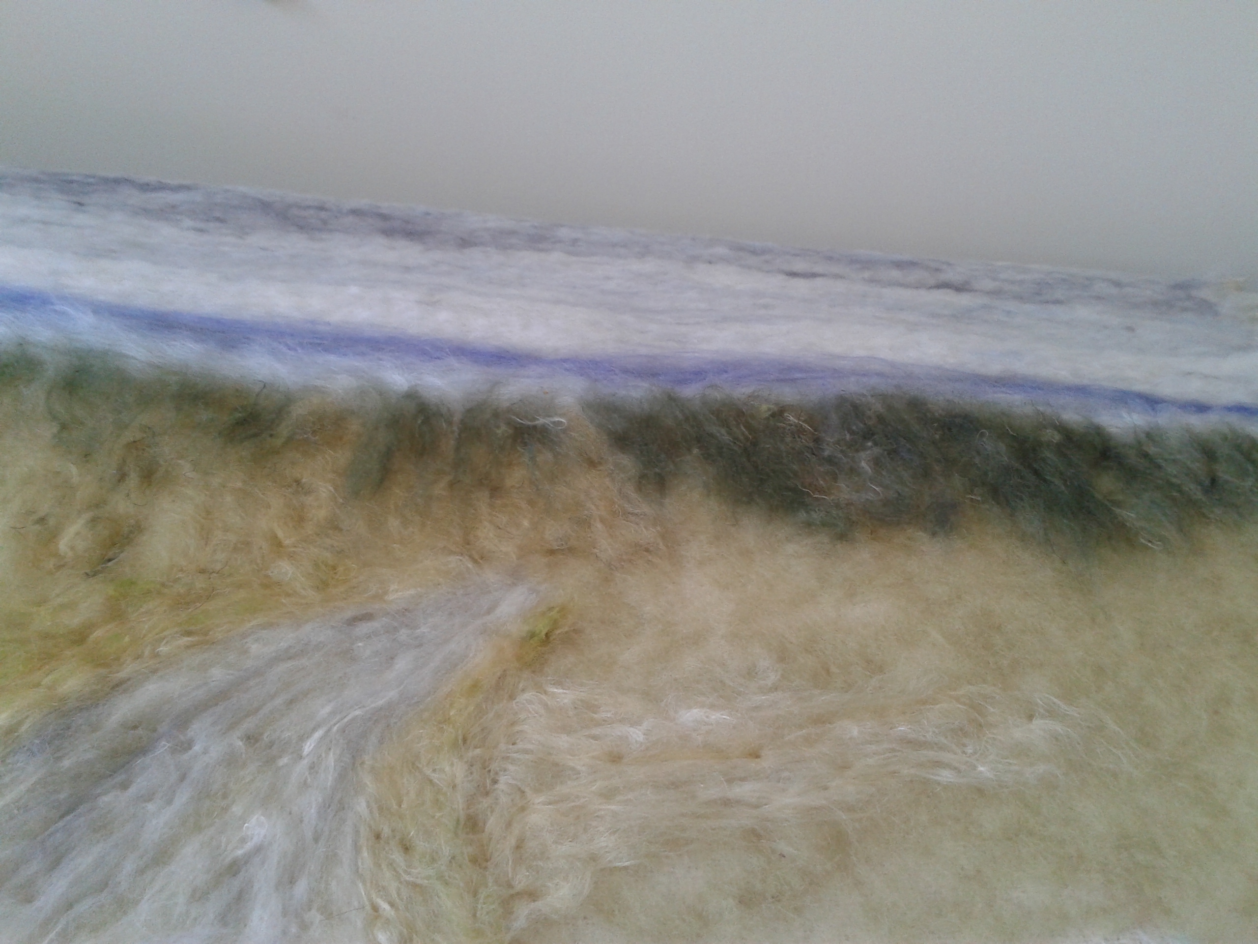
Cheating: My bin of leftover colour and fibre mixes is invaluable for creating backgrounds. There are wool, various silks and even some plant fibres like linen tow in this mix. Little hints of colour provide the illusion of plants in the distance and beneath shrouded layers of plant material. I use the carded bats to overlay the wool-base composition. The far background fields show in the second two images, as well as the tree-line and sky with its cloud formations.

Evening work: I have been working with the shawl, mentioned earlier. My evening work was to unpick the hundreds of tassels that were not only handspun yarn, but cut and looped around the 45 x 45 inch border. Forty years helps to distance you from the work. I’m still looking at how the actual knitted fabric will be used. It can’t be just a shroud, as it would cover too much of the background detail and become a predominant feature – not at all what I want in this work. For now though, I’ve been laying in and tacking the individual strands to create the background grasses. Each row has a subtle shading at the base – the shadow lines.

Here I am about 10 days into the project. I retrieved some of my old handspun and naturally dyed yarns, skeined and washed them to ensure no moths would come with the project. These yarns are invaluable for stems, many of which will have to be created in this work. Thistles are the predominant plant in this image – various species from the giant thistles, the tall yellow sowthistle to the small plumeless thistles with their purple tufts, that we easily recognize. Purple knapweed and Queen Anne’s lace will also occupy a space in the foreground tapestry of colour.

Here’s the moment: I’m now cutting into the shawl. It’s okay, I don’t have any regrets and just have to trust that the lacey pattern will suggest where the cuts should go. Yes, prickly leaves and stems of thistles. I’m liking the way it works, but there will have to be more subtlety if they are to blend in with the silk fibres – it will happen. Just be confident. The opening into the field will also need lots of work to soften and to create the feeling of pushing back the grasses and plants on either side. More shadowing too. I like to leave my studio each day with a plan for what needs to be done tomorrow.

Reviewing: A winter walk is what I need to do now. Just a refresher, even though what I see now won’t exactly match, but who knows what I’ll see. It’s been so drab over the last weeks that a walk into the Shagbark meadow will be just the thing. I also need to get a better feeling for the pathway parting in the work.

Comparisons: I’m surprised at how much the summer image is similar to the winter views, especially with the use of the white wool shawl fabric. In my work for Colour with a U, still to be exhibited in Toronto at Campbell House this April, I combine summer sumac beneath winter hydrangea branches, allowing cutout sections to become windows to the bright colours beneath. I remind myself that the artist does have the license to create the surreal. I’m not sure that this will be the direction my Into the Field work will take, but I’m letting it guide or speak for itself. I’m continuing my journey.

Adding more depth: Now that I have some basic groundwork in place, I can begin to think about the illusion of depth using shadows and highlights. First though, the distant plants need leaves. I have found that pulling tufts off prefelted pieces, sometimes consisting of a wool base with silk top (Chris calls these nuno felts and they are wonderful in that the silk shrinks and puckers at a different rate causing designs that emulate the natural lines and patterns that you find in nature – see the little green piece in the first image).

The plants look a little sparse at this point, but more can be added at any time. A mid-ground tree needs to overlap anyway, so I don’t want to make that too dense. I’m also adding in the heads of thistles, Queen Anne’s lace and various other weeds. I’m still playing with the white stems from the knitted lace.

Challenges: These are all challenges that are exciting but at the same time continually playing with each other. I’ve added in a soft layer of fibre to soften the look and am not really sure how I’ll treat the heads – they’re a little more like a fantasy plant right now. And the two “propeller-like grass heads in the centre are bothering me. It’s easy to simply pluck these felted features right off the surface right now and place in different directions or places – what a versatile medium! I’m also working on the centre parting and don’t want it to look like a spray of stems – a denser, more natural look is what I’m aiming for. There is also the balance of colour throughout the work and leading the eye around. Still the journey continues.

Detailing: I am looking at colour within the overall composition. The “end-of-season” thistles have begun to yellow, providing that rich, illuminating glow. I have been looking forward to adding some of that into the work.

I have used pre-felts in much of my recent work, which I describe earlier. Sometimes I cut the shapes, but have also found that ripping the lightly felted fabric, emulates the sensibility and gesture of foliage. When the viewer looks at any scene – first hand, only portions stand out as truly recognizable shapes. We rely on colour, texture, line and basic shapes to fill in what we know from our own experience. Light illuminates and shadows provide depth and dimension. Perspective, both linear and atmospheric, add to that illusion.

I am looking forward to standing the whole piece up vertically. However, there are the more distant background plants to work on before I get that far. Once I do, I’ll have some space again in my studio. Not sure though how needle felting will work on a vertical plane. Hopefully I won’t break too many needles. Hope to get a few hours in today.

Another day layering and composing: Although these new photographs look similar to the previous ones, they represent a few more hours spent adding more of the cut foliage to the foreground, adding in more heads and working on the taller plants. I’m still not satisfied with the white stems but I can still reposition them and once I start on the overstitching with thread, I can tighten up their thickness. More shadowing might be needed for depth in the foreground as well.

I’ll get a better look at the overall composition once I stand the whole work upright. I’m almost afraid to do that as I’ve become familiar with it all on a horizontal plane. For now, it’s time to take a week away and see what the Caribbean has to offer my creative senses.

Several weeks have come and gone and the above work has transformed: more layering, changed composition in the tall plants and more depth to the entranceway.

My main goal was to get the work to a point where I could raise it to a vertical position where I could stand back to look at it as a viewer. Trying to needle felt in this position is difficult and “tacking” is about as much as I can achieve. Many poked fingers occur because of the awkward angle. The backboard is made from polystyrene and is light enough to flip up and lower again to the horizonal table top.

The work has been lifted to the vertical several times now as I work on the composition trying to intensify the depth of field and create visual transitioning from one side to the other using line and colour. The yellow of the lower left (thistle leaves) is reflected in the mid-foreground on the right side and then back to the left in the yellow flowers of the sowthistle plants. I have added more “heads” being aware that I have might have added too many. I love making them and then creating the 3-dimensional form using the felting needle to enhance the form, and once into the stitching will accentuate that even more.

The last few days have now been focused on stitching. This process allows for more texturizing as well as securing surface details. There will be approximately a week of this therapeutic work ahead. As I complete an area, I needle felt to add depth and further secure any loose fibres that have been disturbed by handling. This is also a useful way to cover any stitches that I don’t want seen although the thread (just ordinary sewing thread) usually disappears into the fibres. Once stitched, the composition is pretty well set in place.

Work was completed at the end of March, exhibited in the Jordan Art Gallery, and sold a week later. Although sad to see it go, I’m also happy that it found a home with owners who appreciated the work. I had fun creating it.

Sumac mid-winter.

Last fall I began taking photographs of images along the Friendship Trail: some close up, some mid-distance and others further away. I didn’t really know where I was heading at the time but knew that what I was seeing must be shared with others.

Almost a year later I have covered four seasons and accumulated enough work to present as a “work in progress.” I’m hoping you will enjoy what has evolved from the first of dozens of photographs above, to more than a dozen completed works. My fibre work has lent itself as a medium that creates the tapestry-like texture and colour that these images so closely align with.

The exhibition was at Lakeside Books and Art in December 2022, but a selection still remains. Others are at the Jordan Art Gallery. For specific information, please contact me.

I began this project as something “just for fun.” For a few years now, photos taken of the giant Iguanas on the island of Cayo Largo, off the southern coast of Cuba (Iguanas below), have been waiting for an opportunity to realize themselves. SAQA’s call for entry, “Fur, feathers, fangs and fins” seemed the perfect fit!

Here we go: I envisioned a wall mounted work to reflect the rock face with the Iguana basking on a rocky ledge. I had saved a silk fusion “skin” from a previous rock sculpture which was never completed. This I thought would give me a leg up on the project. I had also envisioned some very textured remnants of handwoven fabric from my weaving days, covering the rock face and in fact, the Iguana itself – a perfect camouflage fit.

That aside, I began with the construction of the creature. What to use as an armature? I could see some left over pool noodles as just the right size and nice an squishy to shape the body, but wire was also necessary to keep that shape and to fashion legs and toes – oh those toes! How many are there? I researched on line only to read that they could be anywhere from 3 – 5. I zoomed in on my own photos and determined in the end that the Cuban species had 5 and that was what I would go with.

I built a “cage” around the noodles to flesh out the body; however that would not be enough to support the outer skin. I filled the gaps between with leftover polyester stuffing. This all had to be covered to create a nice even and solid surface onto which I would “dress” the Iguana. I searched through my tape supplies to find a cloth tape that would both smooth and hold everything together quickly without having to wait for drying. When fashioning the rock, I had used both PVA and cellulose paste with strips of cotton and cheesecloth – hours of work and time to wait while it all dried.

This rudimentary Iguana shape took about 3-4 hours to construct and was about life size. Gee, I had looked over the prerequisites for SAQA’s call and recalled a very large window of sizing options, so dismissed that and became immersed in the creative process.

I’m starting to “see” an Iguana and it’s turned out life-size. All has been formed by looking over a selection of my own and some posted images of Cuban Iguanas from Cayo Largo and one of its outlying small islands. Apparently, you can take an excursion there to be among the creatures on the beach! https://www.youtube.com/watch?v=NZFskkl3yEo you might like to check this video out. The face was certainly far from correct, but, understanding anatomy, there has to be an allowance for the eyeballs, so plenty of that space.

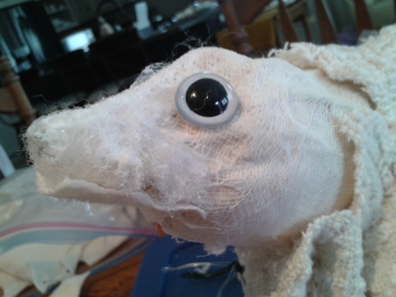
The head structure took a little problem solving: I had some silk fusion fabric left over from the “rock” structure, some toy animal eyes, lots of cheesecloth for a cloth version of papier mache and determination. The head was shaped by building up the structure of the skull, mouth and eyes temporarily inserted (they were blue which didn’t work, so that had to be sanded off and painted white – on the back). With a series of pleated silk fusion shapes, handstitched, the head slowly began to take shape.

Now for the actual “dressing” of the Iguana which I am separating in this blog, but during the actual process, both head and skin were developed simultaneously.

A new update on “WordPress” is allowing the descriptions to show on the actual image, so here in sequence, you can now “read” the process. With a combination of stitching by hand and machine, and using PVA glue to adhere the skin to the body structure, the Iguana is beginning to take on an almost “lifelike” form. It’s almost creepy to hold the life size creature. When our children were young, we had a “pet” Iguana. I don’t believe I ever held it!

Key concepts from 101

Linear perspective, atmospheric perspective, horizon line, vanishing point, organic lines, foreground, mid-ground and background.

This time we are going to apply these ideas/concepts to this architectural form of a modest country church. This is not my own photo.

You will need a regular sheet of letter size paper and a legal sheet (or 2 sheets of letter paper taped vertically) and soft, sharp pencil.

Please do not use a ruler and avoid an eraser until the end.  You could spend the entire exercise erasing and becoming frustrated.  Practice with your pencil until your lines are soft and easily corrected—without an eraser.  Curl your hand so that you can use the outer/baby finger side to slide across the paper as a guide.

In this exercise we are going to use 2 point perspective where previously we used just a single vanishing point.

1.To create markers:  Fold your larger sheet in half horizontally.  Make a visible dot on each end of the horizontal line.  These indicate the horizon and are your vanishing points.  In the picture, the trees obscure the horizon.

2. Take your smaller sheet and fold in half horizontally, then again horizontally to divide the sheet in quarters.  Do the same vertically to create a second set of quarter lines.  There should be 16 rectangles dividing your sheet.

3. Place the smaller sheet vertically on top of the horizontally oriented, larger sheet.  Centre vertically but align the bottom edges.  Tape to hold in place if you like.

4. To create the first pencil line indicating the line of the church where front and side walls align:

Step 1: From the right bottom edge count one and a half spaces in and mark with a dot in the centre of the space.  Step 2: Count 2  half spaces up and make a second mark. 

Step 3. Make a line to create the vertical wall abutment which is closest to the eye (between the window and door).

5. Getting the perspective of the walls:  Without using a ruler, draw a line from the bottom dot to the right hand vanishing point ( on the bottom layer of paper).  Again, the top dot to the same vanishing point—you should have a long, narrow triangle.  Do the same from the top and bottom dots to the left vanishing point. 

6. Create your outside verticals:  The left is about one and a half rectangles in and the right about 3/4 of that rectangle in.  You should now have a box with slightly diagonal lines top and bottom but should have true vertical walls.

7. Roof:  Make a dot in the centre of your page.  From this point join with a line to the left outer wall and a second line to the centre wall. You should have a triangle.  From the centre dot, extend your line to the right hand side vanishing point to determine the slope.  For the top of the roof, count one and a quarter squares in and make a mark to join the roof to the top of the right hand wall.  Join the 2 lower points to form the bottom edge of the roof.

Window and door:  determine the height with small dots .  Although they are actually centred on the building, the near wall portion should be slightly wider than the distant portion to allow for perspective. When adding any detail that requires perspective lines e.g. sills and lintels, use your vanishing points to determine the slope.  Guessing could give you a line that looks askew.

8. Bell tower:  Start with the vertical join which is slightly to the right of your centre line.  The top is slightly higher than your first fold at the top of the page.  Mark and joint with a vertical line.  Extend upwards for the cross.  The top of the cross should be on the same slope as the walls—use your left vanishing point.

9. Roof line slopes:  From the ball, make a diagonal about 1/2 inch out on either side and about half way down.  Notice that the tower is joined into the roof about 1/2 inch down and the top structure sits on a small “foundation.”  Use the vanishing point on the right to determine the angle.  Create the inner framework of the window openings and extend the roof seams  of the tower from the window peek to the tower peek at the ball.

At this point you can take out a ruler and eraser to neaten things up—but you may like the way it looks drawn freehand.  Be sure that all vertical lines are TRUE verticals and all lines that would be “horizontal” on the actual structure, go back to the vanishing points on a diagonal, even if they are just tiny window sill lines.  This drawing will serve as your pattern.

Now that you have your church drawn (congratulations, this was not an easy exercise), continue to add the background and any details that you would like to add in, although that can happen as you work on your textile or fibre piece.  Just remember the perspective rules:  Objects and details are larger in the foreground than in the distance and atmospherics can create more depth to your work. 

Steps outlined visually.

The SAQA pod has taken up the challenge to render this more difficult exercise.

Effie took the concept to re-imagine the traditional “log cabin” quilt. Here she has placed the structure within a forest with a path leading to the front door. The colours give us a “rustic” feel and even earthy smell of an evergreen forest.

Pam has interpreted the “grain elevator” icon from her connection with the “prairies” of mid western Canada. The beautiful perspective of the structure and linear rows of grain is enhanced by the addition of the foreground hay wagon. The eye is led into the scene and wanders through via the linear connections. Colours and fabrics are well-chosen to provide the illusion of light.

Comments: A little more angulation upwards of the cabin’s right side foundation line and windows would give a feeling of receding into the distance. Exaggeration of the path’s width as is leads forward would provide a foreground dynamic and work in conjunction with the larger tree forms.

The wagon in the prairie scene is beautifully rendered. A slight exaggeration of this form would also provide further dynamic to the feeling of foreground perspective.

Both wonderfully executed.

This is a significant date for Southern Ontario, for the SAQA (Studio Art Quilt Associates) organization and for me personally. It represents the beginning of an unexpected change in our lives: Ontario was on the brink of closing down many non-essential businesses and events and its citizens going into self-isolation, and SAQA’s first international conference was on the brink of opening in Toronto that coming week. All was rapidly changing.

As I made my way down the Niagara escarpment to work at the Jordan Art Gallery , I saw before me a compelling site:

It was an image that would not leave me and percolated through my thoughts until early October. (Meantime, SAQA held its global conference in virtual time – one of the first organizations to do so via the Zoom platform. It was an amazing success offering its prearranged conference speakers and chat rooms for registered participants. So, although there was much disappointment that our organizing efforts had to be rearranged and travel plans cancelled, we still “met” and shared each other’s experiences, knowledge and talents. The Jordan Art Gallery closed its doors until May, but continued to “open” to the public via its website. As an aside, we sold our Fenwick home that weekend and bought a new townhouse in Ridgeway. The start of another chapter in our personal lives.)

The image was “larger than life” which in my mind commanded a scale beyond my usual. I had saved an old “throw” that had enough porosity to allow for needled felting. It measured just enough for SAQA’s call for entry themed/titled “Light the World” https://www.saqa.com/events/saqa-calls-entry, which I had thought about as well over the summer. Now was the time to begin with a deadline of November 30. I had not entered a needle felted piece, so this would be the first, and it would incorporate stitching through layers. There was also a scurry of improvising as my 12 inch square sponge was not going to offer enough underlay for working up the piece. Hastily, I peeled away the covers of my 4 flat outdoor sponge cushions and laid them out, side by side. They nicely fit my fold out table width-wise and the 60 inch width of the work.

As with all my other needle felted works, the ground composition is laid out with wool, then the detailing layers comprise various silk fibres and other plant and animal fibres to add texture, colour and light – lots of it in this case to work with the image which I put through Adobe Photoshop to enhance the blues and contrast of the original photograph. The composition nicely fit the “x 3” rule.

The above images show the work progressing in its early stages from something flat in both colour and dimension. As contrasting colours and materials are added, the image and impact should, with some luck (for I believe it is only a select few works that have a magical property), begin to “appear.”

As the work progresses, it is both exciting and disappointing. As with any artwork, there is continual problem solving and a switch between observing, rendering and tedious work. There is endless needle punching involved, first securing with a single needle, then using my spring loaded, 5-in-one punch to work with the texture and against it. By the time all is completed, I will have worked over the surface more than a dozen times. With the smaller works, I also flip the work over and needle felt through the back layer as well to secure in both directions. I am not sure if I will with this piece.

After many hours working on the sky formations, it’s time to return to the foreground. My handspun is invaluable for outlining the tree formations and beginning work on the vineyard. I have run into a roadblock with the mid-ground skyline. As the tree formations extend into the sky background, I will have to stop to work on the Toronto and surrounding area skyline. But just how to go about this work is foremost in my problem solving mind.

Using my Publisher program together with some mathematical calculations, I am able to generate an exact skyline. The remainder of the work is my own rendition; however, I feel it important that the skyline be recognizable as what it is. Colour and eventually light will be important, as well as the profile. The skydome is really prominent. See below the steps from felting the long blue skyline to cutting then felting in place. I can now go back to build the tree tops that overlap into the skyline.

My next posting will cover the foreground as I build up texture, colour and light. It is amazing how much the eye begins to see as the work progresses.

Several weeks have gone by, but I have been busy. With the November 30 deadline for this submission looming, my focus was on completing the project. Days of adding detail and texture, working on the composition itself and stabilising to a quilted backing (repurposed, bed protector quilt). Below you can see the dramatic cloud formations taking on more dimension and contrast. The top layer of felting is now being stitched through to the backing to stabilise and to add a 3-dimensional effect.

The foreground was an especially detailed portion of the piece requiring both the application of fibre variations for texture and colour, but also the overlay of handspun yarns which required invisible stitching to anchor securely. Here you can see the sewing pins anchoring the top layer to the backing ready for stitching. The reverse is just a recycled, quilted cotton bed protector.

The quilt is nearing completion with just edges to finish before photographing. I set up my new photography studio for this large needle felted work. Using the tip from SAQA to use insulation panels, I took 3 side by side, covered them with stretched canvas. This method allows you to use sewing pins to hold the work in place. Below is the final work, 45 inches high x 58 inches wide.

It was submitted to The Grand National call for entry “Crossroads” with the following statement and biography. I have a price of $3,500 on it.

Corona Premonition, March 13, 2020

For Southern Ontario, March 13, 2020 signifies the end to large gatherings, closure of non-essential services and isolation.  My needle-felted artwork is based on a photograph which I took on that symbolic day.  This premonitory view of a “corona” cloud formation above 17th Street descending the Niagara escarpment, over Lake Ontario and distant Toronto also captures a physical crossroad leading into an unawakened vineyard.  17th Street itself leads to old Lakeshore Road which runs the circumference of Lake Ontario.  The work is a metaphorical crossroad intersecting the “normal” and the “pandemic” landscape.

My fibre and textile artwork explores nature and its ecological fragility.  Educated in fine arts and interdisciplinary Canadian Studies provides me with a rooted knowledge; my lived experience in the Fiji Islands, New Zealand and Canada, my career as an educator, and my travels, prompt me to create and share these perspectives. 

Needle felted and quilted image Corona-Premonition, March 13, 2020

Update: The artwork has been accepted into the Crossroads exhibition and will travel Canada over the next 2 years.

Our SAQA Pod took on the challenge of understanding perspective through a fairly simple landscape/seascape image.

Here is lesson should you like to give it a go:

Perspective 101

Instructions by Greta Hildebrand, September 2020

Don’t let the idea of perspective prevent you from going in this direction.  Perspective is not difficult once you know what to look for and what to do!

I have Googled the word and find that there are several definitions, but basically, if you can understand just 2, you’re well on your way. 

a/ Perspective can be, LINEAR meaning the lines in your image diminish into the background.

b/ Perspective can be ATMOSPHERIC, meaning that the objects close up are generally brighter and more in focus than those in the distance.  This is caused by the amount of water in the atmosphere, impairing our vision of objects far away.  It’s also because our eyes don’t focus that well on distant objects.

Combine a. and b. and you have something that gives the illusion of space.

Here is a photo that I took last week on Lake Erie from Windmill Point, looking West along Lake Erie. It’s one of my favourite walks since moving to Ridgeway this summer. 

Looking West from Windmill Point, Fort Erie

We are going to create a pattern, then, using our preferred materials/medium, create our own version of the scene.

Next time, we can work on an architectural image, but for now, this is a much easier way to understand the concepts.

I would like you to take a piece of unused paper – letter size is good for this exercise.  Also, a nice pointy pencil.

  1. Orient the paper vertically and divide in half, widthwise. You have just created your HORIZON LINE – where water and land meet the sky in this case.
  2. Now, in the centre of your horizon line, make a tiny dot – this is your VANISHING POINT. If you look at the picture, you have just made 2 markers:  one to divide the skyline from the water, and the other, the end of the beach, as we can see it.

If you look carefully, you’ll see that the lines are not straight and that’s because our subject is found in nature.  We call these lines “organic”.  There are lovely curves/arcs in this image.

  • First bring your horizon line to the right, horizontally, in a nice curve about 2 inches down from the horizon. This line is now the base of the tree line.
  • From your vanishing point, create the waterline in a curve to the left, just a little lower than the treeline – notice that the line is not perfect and goes in and out – the result of waves.  The curves are closer together in the distance than in foreground.

Look at the way the debris on the beach forms a line on either side of the vanishing point, forward.  It’s really wide in the FOREGROUND and diminishes towards the VANISHING POINT in the BACKGROUND. 

  • Now, create a line for the top of the trees – note how high the trees in the MID-GROUND look compared to those that extend the coastline right to the left edge of the HORIZON LINE.

See below for the 5 steps as diagrams.

Diagrams leading to a pattern for your own creation.

Congratulations.  You now have a grasp of perspective and a vocabulary to go with it:

Linear perspective, atmospheric perspective, horizon line, vanishing point, organic lines, foreground, mid-ground and background – and, I bet you knew all of this before.

There’s still the other form of perspective, ATMOSPHERIC, that gives further dimension to the image:  bright and sharp in the foreground and less so in the background.  Colour is affected as well, as objects close up are brighter than those further away. This concept also applies to the sky – lighter on the horizon and much more intense in colour directly above.  The size of clouds overhead are much larger than those further towards the horizon.  Check this out next time you’re outdoors on a clear day.

Let’s take what we have done to be our pattern.  From here, you use your own fabrics and other media, using this one as a starting point.  Create your version of the beach scene.

Today was our regular meeting date; replaced by a combined email in-Facebook record of how people were working through the perspective exercise.

This is how my own efforts progressed:

I worked on a tiny piece measuring approx. 5 x 7 inches that I would like to insert into a deep frame to give a rounded 3-D effect.

Starting out I lay the wool fibres on the loose Merino felted wool base. This provides me with a foundation composition – note that I am following the horizon line, the vanishing point, the base of the treeline, the water line and the top of the treeline. I’m not too concerned about shading at this point.

Next I lay carded/blended silk fibre over the top tor the sky, then white wisps of white silk for clouds. Next I work on the waterline trying to achieve somewhat of a wavy line, but this will be enhanced later.

I am next going on to the trees which have more texture and detail. There is a little of early autumn showing in some of the trees; however this has to be very subtle. As the treeline diminishes into the background, the colours become more faded as atmospheric perspective.

A little rough green silk is added to the beach to give the impression of the seagrass – larger in the foreground and very subtle hints into the background. I add a little more white silk to the beach in the foreground to bring it forward.

Clouds become more obscure as they fade into the horizon. I turn the edges of the felting under and felt to the back to create a “turned” edge. I back the piece with 3 consecutively smaller layers of backing to give the piece some rigidity, then stitch through the layers to anchor and further enhance the treeline. I have bent the piece into the deep frame so that it curves towards the centre. I think I’m done!

Hope you enjoyed this exercise in perspective. Next time we can do an architectural piece. Let me know through my website or email if you’d like to join in.

Here are some of our group’s results, including mine above. Some are still works in progress.

Can you find and correct these challenges?

How could you improve the shape of these deciduous trees?

What happens when the horizon line is not horizontal?

What direction do waves normally roll into shore?

What happens to the foreground when a wave is as long as the beach-line?

Where is the sky most intense in colour?

Where is the darkest part of a cloud, usually?

These are not meant as criticisms, but observations that allow perspective to be seen for what it is. Creativity, however, can trump realism, and in so doing, allows for our own creative interpretation of reality.